Tuesday 19 May 2020

Compositing and Finishing Touches - SPnU

In this stage, communication among the team was vital, to iron out all the things to fix. Keeping a consistent file naming and organising system helped in the efficiency of this stage a lot. After a lot of colour matching, and audio tweaking, here's the final product:


What went well:

  • The strict organisation helped this process go smoothly, 
  • Using placeholder roughs meant I could swap in the finished scenes, which gave us more time to animate while compositing too,


What could be improved for the festival submission:

  • Our main goal to is to have this shaded by the 10th of June,
  • I plan to find a way to stop the banding of the glowing gradients or maybe soften them.

Monday 18 May 2020

Shadow Cleanup - Heart of Stone

I volunteered to cleanup the shadow flashback scene that I roughed out. Doing the vertical slice for this earlier REALLY helped me figure out a good technique and workflow to creating the shadows. Since they were only shadows, I only had to focus on creating clear silhouettes and not the details inside which went a lot more smoothly than if they were actual detailed figures.

Also since the shadows were true shadows (the lines sometimes became inverted), I had a lot more control of the depth and layers of the shadows.

(Vertical Slice)


Since the Heart of Stone project was rescheduled to be finished after the deadline, I had to put off this scene for quite some time and was unable to completely finish cleanup of this scene before the deadline. This is what I cleanup so far:


Friday 8 May 2020

FIRE!

I've begun to really like effects animation, and animating fire especially. I've even considered the title 'digital pyrotechnician'. But I don't want to confine myself to just one effect (even though having a niche would be beneficial). Anyways, I animated fire for a few different projects and here's what I learnt from it:
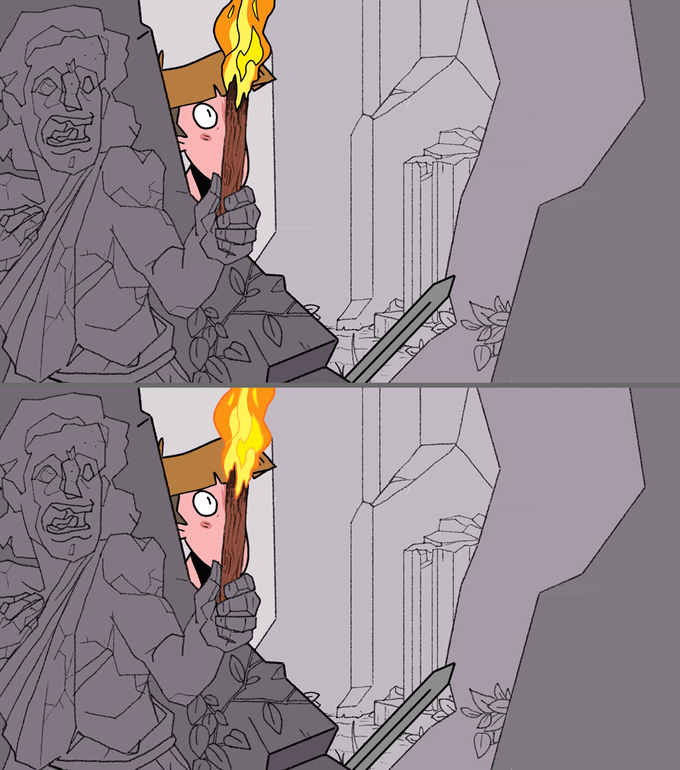

Heart of Stone

The fire effects in this project are entirely secondary, just the fire on the torches (there were effects in the shadowplay flashback scene). I had to match the style of the fire very carefully, since the background art style and the character art style was slightly different (the background is more detailed). Since fire can be considered both a background element and a character, I settled for a moderate amount of details.
While testing out linework colour, I realised it might be best to wait for the finalised background for colour contrast and adjustment (the same is true for the lighting effects too).
Since this project wasn't scheduled to be 100% complete (and the fire effects come after the base animation) I wasn't able to get much done before the deadline, but I plan to recreate this style of fire for the torch scenes.


Sleep Paralysis and You


Here the fire played a more prominent role in the narrative.
I experimented with a lot of effects to create moody, hostile-looking fire, and to save time I generated the sparks and embers using After Effects. This added more atmosphere while also saving time.


I wanted the fire to move almost like it was out to get the main characters while still being elegant and smooth (the practice I got in the 601 module really came in handy!). To save time, I reused a few fire animations and repurposed them for different scenes. In the final edit, I tweaked the colours a bit in the final for a more reddish, omenous glow.


Mythical Deer


The fire in this project was in the form of a magical door and had to match a stopmotion puppet animation which was the most challenging style to match. I aimed to make the fire as close as possible to real fire, with the magical component too.
Matching the fire to the puppet motion was a challenging since you we can't really reshoot the stopmotion animation for clearer, more extreme key poses that would've given the fire a clear cues on how to move. Also there was no physical lighting cue in the stopmtion shot so I had to do it in 2D animation which isn't very believable. However, since the fire was magical, I was able to change the colour of the fire to suit its 'mood', shifting between default orange, to energetic yellow, and dying red.

Wednesday 22 April 2020

LoopdeLoop - Mushy


Yet another Loopdeloop, I used this opportunity to experiment with After Effects Duik rigs instead of my usual 2D tradigital style. Experimenting with After Effects rigs opens up my animation range and is a viable (and faster) substitute for my usual 2D hand-drawn animation. Using the Google Images filter to find images I could use legally, I assembled a somewhat grotesque figure based around my previous character design called Bowler.

Previous pixel art animations of Bowler (dated July 2018)

I "storyboarded" this project in TVPaint (so it turned out to be a lot closer to an animatic). I also figured out the ending more organically since a Duik rig allows for a lot more freedom to animate.


What went well:
  • To create the mush, I stitched together different images for texture and colour i.e. I had to create banana mush using pizza dough, mashed potatoes and a slug for texture (a lot cleaner, faster and less wasteful than making and photographing the mush myself),
  • Managing the numerous assets went smoothly becuase I organised them carefully into separate folders and PSDs,
  • The photorealism brought an uncanny feeling to the animation, which is the aesthetic I was going for,
  • Using a 3D spherical warp on the face gave it the illusion of turning in 3D which I thought was really clever,
  • I wanted to put a heavy emphasis on character animation on a blank, expressionless character, so I used a lot of body language and hand gestures to convey that character.

What could be improved:
  • I've been wanting to do a loop with more than one camera shot/angle, but the mush-zoom doesn't count as a different camera shot for me,
  • The zoom also blows up the resolution and shows all the defects, even if it does exaggerate the impact.

Saturday 18 April 2020

Sound ahoy! - SPnU

We finally have the first draft of the soundtrack from Ellie!

We had a few notes of feedback that we compiled in a spreadsheet since discussing this in person was not possible (social distancing and all).
We tried to be as specific as possible to avoid confusion

After a bit of back and forth, we (or rather Ellie) refined it to a level we were happy with:


Friday 3 April 2020

Working from Home - SPnU

Due to the disruption caused by the coronavirus pandemic, we had to shift our deadlines around:

Damo (the producer of this project) tweaked the spreadsheet

The main changes were the deadlines for cleanup and colour as we realised we needed more time, we also planned it so that we'd be done a week before the deadline to polish things up a bit and for last-minute changes.

We were also unable to book out microphones (also it would've been a disproportionate effort for something with so little impact to the film) so Ellie, our musician, came up with the idea to pitch down the previous gasps she had recorded. It's not ideal, but it's time-efficient and it works.

Another hurdle we had to overcome during the colouring stage was the weird anti-aliasing interfering with the fill tool (I'm not sure of its official name), I came up with a not-so-effective-but-it-helps type of solution which I thought would make it less of a strain to correct. This tip works particularly well when dealing with flats of more than one colour:

Wednesday 25 March 2020

Roughing it out - Heart of Stone

I started animating some of the roughs for Heart of Stone. I took on scenes with elements I was comfortable with (things I could also specialise in) like effects animation, morphs and fire. I'm also responsible for the torch fire animation in this production as I have taken a liking to animating fire and everyone loves fire in their stories.

These roughs took me a few weeks to get done, since we're doing the rough and tie-down stage together they require a bit more detail than a regular rough:


I also experimented with fx styles, trying to tie in that greek vase style to the animation:
Some patterns that inspired this, the waves informed the water fx and the zigzags informed the impact fx

We chose style 2 for its balance between style and clarity.

What went well:

  • Using style inspiration/reference for the effects helped make it feel more authentic,
  • Basing the character animation around the singing ("yoouuu'll do so we right here dear!") brought a lot of performance into the animation,
  • A lot of my scenes involve shadows/silhouette, so I developed an eye for silhouette clarity and form.


What could be improved:

  • I still have one more scene to rough out, this delay could be because of the workload I'm taking on, or because of the influence of the coronavirus pandemic, I think it's a bit of both. 

Update:


I managed to finish the last rough scene I was responsible for fairly quickly, since I've already animated a lot of shadows and silhouettes for this film!


Wednesday 18 March 2020

Oh Deer - Paper Cut Out Segment

To quench my generalist animator needs, I volunteered to help out with the paper-cut-out segment in Petra's animation. Ironically, only time will tell if this was a wise decision in terms of time management since I'm already part of a few projects at this point. But paper-cut-out animation is pretty interesting to me, especially when there's fx work involved too.

I did a test to gauge how demanding this medium is, what frame rate to use, and which asset-creation methods work best.

From this, I learnt it's easiest to work on a lower frame rate, with fewer details in the flames. I also learned to keep edges and tangents controlled since those are difficult to cut out.

I also simplified the faces of the character designs Rhys created, to be turned into paper cutouts (with Sophie's help too, she designed the bodies). I came up with two design types, one closer to the original designs, and the other with a more simplified, and distinct shape language:


I got through making one complete head before the coronavirus pandemic got really bad and we made the decision to drop the paper cutout segment entirely since access to the stop-motion facilities in university wasn't possible. My disappointment is immeasurable and my day is ruined. 

Friday 13 March 2020

Character Design Arena - Flameingo Fighter

On Instragram, Tanner Wilson (@t.m.wilson), a character designer I follow hosted a Character Design Battle of sorts. As a character designer and illustrator, I felt this brief was perfect for me as I enjoy designing fighters. This brief also helped me practice on a brief with a short deadline, while also getting my profile out there. I also wanted to implement some sort of fire element as I've been animating a lot of fire recently. Introducing the Flameingo Fighter!

Since the rules specified that it had to be a single pose on a flat background, I didn't bother with making a turnaround, though that would be helpful if I ever want to animate them.

My process was pretty straightforward, I wanted to create a character based off the pun 'flameingo':
Looking at different ways of blending bird and fire, while also looking for an art style that suited it
After narrowing down and combining the elements I liked, I started exploring outfit and colour scheme:
The clothing was used to show some more flair and character backstory

I feel the pose is a bit too static to express the flair this character has, and the outfit is a bit too simple for an illustration (perfect for animating though). I could've also played with light and shadow more because of the fire but the time limit for this project wouldn't allow it. Overall, I'm satisfied with the character but if I were animate them, I would probably develop the character more to refine them.

Wednesday 4 March 2020

Phrog Texturing

I worked closely with Rory to transform the 2D character designs into a fully-realised 3D model (this gave me a brief idea on the dynamics and roles in a 3D CGI pipeline). And while Rory did the majority of the work, (he modelled, rigged, unwrapped and displacement-mapped the Phrog, while I used the unwrapped geometry to create the base texture), I got a better understanding of texturing a complex 3D rig.

Unwrapping UV 


I did attempt to use Mudbox to add extra details but I quickly realised that learning a new software might not be time-effective (since I had other projects to work on too). I tried other techniques to add colour to the model (using Maya), and this yielded slightly better results... though still not quite there.

Experimenting with Mudbox tools gave birth to this abomination, which I managed to salvage into a meme.

I downloaded a few, free 3D frog model to use as a test and learnt about the whole process. I was only vaguely familiar with this method from video games and the 'skins' in them. 
Test 1 failed spectacularly, partly because the model was a hollow piggy bank (froggy bank?) and because I was too sloppy with the UV cutting and unwrapping. However, this did teach me the basics of using nodes with materials in Maya:


Test 2 was much better since I took the time to carefully cut and unwrap UV (though it could be done better). I learnt to use landmarks in the mesh to make sure features weren't misaligned.


Painting textures 


Since both my computer and I were struggling to get a proper unwrapped UV from simple frogs (let alone an alien one), Rory the resident-3D-wizard kindly unwrapped the Phrog UV for me and I got to work painting it in Photoshop. Here was where I explored a bit more creatively, trying to stay true to the initial character design, but also implementing what I learnt from the frog tests.

Main body textures
Inner mouth textures
I made sure to use reference images as a foundation for a lot of these features while adding/mixing fantastical elements to it. I realised the texturing didn't have to be hyper-realistic, thanks to Rory's displacement map (from Mudbox) doing all the heavy lifting. I simply had to create the illusion of texture, like contouring in makeup to create 'pseudo-textures'.

Some renders of the textured model by Rory
Some hitches along the way, I didn't extend the edges of the UV far enough in some places, resulting in gaps.
Overall, I'm surprised and impressed at how well this process balances the technical and artistic sides, and I look forward to more 3D ventures in the future!

Mood and atmosphere - SPnU

After the rough animation was fine-tuned and corrected, we began on the tie-down and clean up stage of production. I incorporated the rough and clean-up stage together but allocated separate time for both. I tested out desaturating the scenes in which the Demon is visible to add mood and make her silhouette stand out that much more, using the two complete scenes we had of her.


I've dubbed the desaturated look "Demon mode" which I think works better than the regular version. I also tried 50% desaturation and other levels but it didn't look as good as the 100% desaturated. Regardless, I can still experiment with this in post-production.

I also tested out some drowsy effects, that would pair well with the sound warping as Kilo struggles against sleep. Using Damo's roughs, I experimented with turbulent warps, blurs and offset layers to get an idea of how to achieve a cinematic effect, but I think it would work better with more finished versions.


Update: I also added a few colour adjustments to immerse Kilo in the scene without the need for shading, and to make the fire scenes more omenous. This saved valuable time since we didn't need to shade (though we plan to add in shading after deadline for festival submission).

Saturday 22 February 2020

Sounds like trouble - SPnU

After the recent weekly, the sound design was mentioned. More specifically, we needed to look into getting a voice actor to do the breathing and gasping sounds (something I overlooked). Ellie, our sound creator, sent us a few foley sounds a while ago, before we animated roughs, and I crafted a sound design spreadsheet (oh yeah) to keep everything organised. This also helped us identify what we need the supposed voice actor to do. We considered getting a voice actor to do the audio, but it seemed unfair to them to simply breathe and gasp, so we opted to do it ourselves.


We also updated our roughs and made notes on things to fix as we started the tie-down phase of the animation. Our sound designer, Ellie, also supplied a lot of the foley used in this:


The feedback this weekly also mentioned my starfish fire rough for the last scene (though I didn't see anything wrong with it, I acknowledge the audience might not think the same way as I do) so I tested out creating embers using reference (I didn't have much to go on but I used artistic license to make it look good):
Starfish fire (in the top-centre-left)

Floating sparks and embers (a lot more randomised in the final)

What went well:
  • Efficient communication meant we were on top of things and organised,
  • Having regular feedback sessions (both in and out of the Weeklies) meant we fixed problems before spending too much time on them.

What could be improved:
  • Having the same deadlines for all of us for the stages of production meant I spent a lot of time procrastinating-with-justification (I was done with my roughs quite early), a better method would be to have the deadlines be recommendations or to have personal deadlines too. 
  • On a more personal note, I'm trying to learn to take any criticism, even criticism that doesn't seem constructive, as something to improve on (sure, I can't appeal to everyone, but I can try to understand why people think the way they do).

Saturday 15 February 2020

More rough animation... AND FX! - SPnU

I managed to finish the rough animation of the scenes assigned to me early, so I got to work on some of the fx work. I roughed out the fx of a few scenes which already had rough base animation, using reference footage for this was a godsend, since cigarette smoke acts in a very unique way and has a consistency that's a cross between incense and chimney smoke:

While compiling a lot of our roughs together, we realised the cut between scene 0 and scene 1 felt a little off or rushed, so we decided to add a scene 0.5 of Kilo getting out bed (we also cut out scene 15 because of the same reason). I decided to reuse a background (so as not to overburden Halli) and I got to work on animating it. The problem here was the complex perspective on this background:


So I did what worked for me in Days of Heinz Past - using a Maya previs, and thanks to Tisa's room model she made during the storyboarding phase, this wasn't too difficult:


This also helped with the pacing of the film, building up the anticipation and importance of the dreamcatcher even more.

Friday 14 February 2020

Vertical Slice Changes - SPnU

When Rob asked us to do vertical slice we got right to it, only to realise we'd already done something similar - a colour test. Halli threw the character design of Kilo into a scene to see if the colours worked right and how shading might work but we hadn't yet followed the processes of the pipeline from start to finish.

Vertical slice by Halli (Kilo not to scale)

I also took a frame of a scene I'm working on from start to finish, to see how everything would potentially work:

I outlined all the brush setting and tool techniques so the final animation would be consistent

I then tested out different styles of shading, weighing their pros and cons:
Flat shading - Pros: Saves time, Cons: Less visually appealing
Background shading - Pros: Matches backgrounds, Cons: feels flat
Cel shading - Pros: Conveys mood well , Cons: time-consuming
 For now, we've decided to go with the middle option, background shading that doesn't move but still shows light and dark. This might change though, depending on how much time we have left.

Tisa also turned a rough scene into a vertical slice to test how the demon looked with the backgrounds:

Link to Tisa's blog post about this

We realised that the grey overlap outlines looked odd in motion, as they bobbed in and out of existence. And so I updated her character design to have completely grey outlines (we also tried black and white outlines, but grey worked best):


Then I put all the character designs into a universal template for consistency (Kilo designs by Damo):


Also did some book/prop concept sketches

What went well:
  • Doing the vertical slice proved very useful as we were able to iron out the kinks beforehand,
  • Efficient communication and teamwork meant we had 3 times the vertical slices we needed.


What could be improved:
  • The vertical slice should've been done much earlier (what if we found that making SPnU was practically impossible after months of work??).


Wednesday 29 January 2020

LoopdeLoop - Whoops

This was my submission to the theme Whoops for this month's LoopdeLoop:


Submitted on the deadline day

This project was slightly rushed since I had so many ideas to go with (and I did a lot of preproduction for each before actually sticking to one idea). This brief helped me practice my 2D hand-drawn animation and some liquid and intensity effects animation.

An amalgamation of scrapped ideas and doodles (that I can hopefully recycle for other projects). 

What went well:
  • The foley and sound design really helps sell the movements, the breathing and character noises also help the character acting,
  • The liquid and energy fx work really well (thanks to all the practice I got in my COP3 project),
  • (Update: It got featured on Loopdeloop's Facebook page!)


What could be improved:

  • I spent too long on preproduction, I should choose an idea and stick to it before developing the idea any further to be more time-efficient,
  • I still want to try making a loop with multiple camera angles and movements instead of a static camera to make it more immersive/cinematic.